


Our Top 5 Graphic Design Tips for Small Businesses
Graphic Design is a beast. It’s everywhere you look, it’s one of the most effective parts of marketing, and if it’s not done correctly, it can push customers away instead of bringing them in.
Our graphic designers know every technique to make your marketing materials as attractive as possible. Here are our best tips for improving design in your marketing.
1. The fewer the colors, the better
Colors can make design look bright and exciting or calm and professional, but no matter what you’re trying to convey, keep it to just a few. Too many colors can make your design look unorganized and unattractive, thus giving your customers a bad impression.
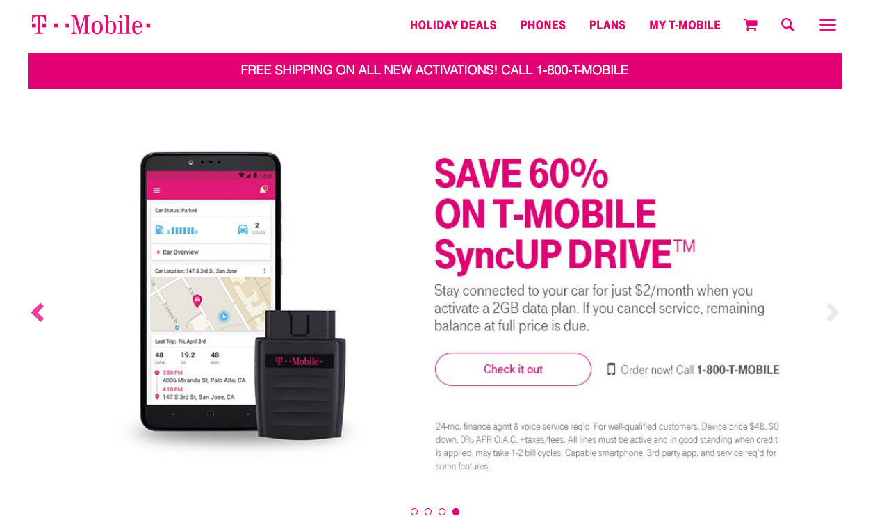
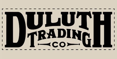
Take a look at some popular brands like Facebook, T-Mobile and American Eagle. They keep their main color count to one or two (not counting black and white), sometimes three. But usually never more.
Industry giants Google and Windows use four colors in their logos (peculiarly very similar colors), but logo design is a whole different story (Google’s main color is arguably white). Plus, they’re the giants. They’ve earned another color.


2. Simplicity is key
Good marketing materials can express a message in just a few seconds (for this reason, billboards often have only eight or fewer words). This means cutting out the clutter. Limit your redundant shapes, extra photos and unnecessary words.
Business owners often want to use up every spare inch of empty space on the page, but few know that empty space can actually make a message stand out even more.
Take a look at the two advertisements below. Which message is easier to read?
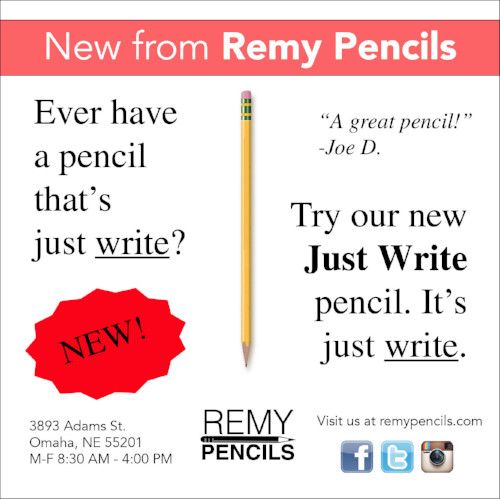
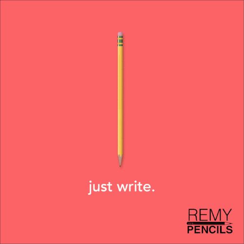
It’s okay (and beneficial) to have just one message per advertisement. And most of the time, you can even leave off all contact information aside from your name or logo. In today's Google-dominated world, if a customer wants to find you, they’ll find you.
3. Consider the viewer
This tip is useful for design as well as all marketing elements, such as writing and strategy. Who is going to see this webpage or brochure? Think of age, gender, hobbies and location.
If you design a promotional piece about a summer camp for young children, you may use bright colors, a large, friendly font, and tilted images for a sense of fun adventure.
On the other hand, if you’re making a webpage for middle-aged professionals upgrading their office chairs, you might use strong typeface, cooler colors and one large (non-tilted) photograph.
4. Alignment is favored
Humans love straight edges and right angles (which is odd considering we tend to be curvy and edge-less). We love things that line up nicely even if it’s unnoticeable.
Look at some logos around you. A lot will have two lines of text or multiple layers that are all set perfectly to the left, to the right or in an invisible rectangle. Alignment is necessary for readability as well as general appeal.
5. Have a purpose to every element
Everything in your marketing piece should have meaning. Each photo should impress, every line should separate and each graphic should be there for a reason.
Adding random components will likely throw off the viewer's concentration and if your piece is too unorganized, the viewer moves on. Remember: page turns are easy, and back buttons are even easier.
Better design is ahead
This is just the tip of the design iceberg, but these pointers should get you headed toward a better design. Need more help than this? Give us a call. Our designers know all the skills (and we mean all of them). We can get your idea onto paper – or computer screen.
Get a Quote
Tell us as much as you can. We'll help fill in the rest.